
Webpage Refresh
This project focuses on the creation of Website's Careers Page to allow candidates to apply directly on our website through a web form for open positions we are seeking to fill. We were a team of three people taking on our first industry design project.
XP3 Talent System uses a unique combination of web-based tools, training, coaching, and talent acquisition to help you build an employee-centric, profitable company.
My Role
Team Lead
Research
UI/UX Design
Usability Testing
Front End Developer
Timeline
4 weeks
Tools
Figma
WordPress
With the ongoing development in technology, companies are wanting to refresh their websites to increase work efficiency. The previous workflow consisted of manually inputting potential job applicants' information from Indeed onto their client portal. They wanted to find a solution that allows them to have the information automatically transferred. They aimed to introduce a method to have applicants apply for positions directly from their website.
During the first meeting with the client we wanted to confirm the project scope and confirm what the expectations of the project was. The outcome of that conversation was that we were going to:
1. Redesign the career opportunities page
2. Create a job posting page with an application form attached
3. Create a success page
4. Implement the design onto WordPress
The client's request for us to integrate the design into WordPress fell outside our scope, as it aligns more closely with the responsibilities of a front-end developer. We informed the client that while we lacked experience, if we had sufficient time afterward, we would try our hand at it.
Crafting a Streamlined Workflow for Maximum Efficiency

Following the initial meeting with the client, my team and I looked into a few different companies to see how they were implementing webforms onto their webpage. The goal was to get inspiration on the different features other websites are using.
Decoding the Competition
After presenting it the client, we received feedback on their preferences and concerns regarding each example.
Key Takeaways
likes the search box on the side and to host specific filters such as location, industry
they prefer a simplistic style and would like to portray a warmer feel
they would like the job posting page to have the different companies logo to make it feel more personable
include a video of the company for the user to feel more enticed to join the team
Crafting the Blueprint for Success
The client did not have a design system in place, but they did provided us with their current logo and from that we were able to grab the color code by dragging the image into Figma. In order to figure out which fonts are used on their current website, we inspected the "Career Opportunities" page, and from there we created a simple style guide to utilize in our design.

Ideation
The next step in our process was creating wireframes to bring the vision to life. During this process we were keeping in mind the clients' preferences in mind.


Wireframes
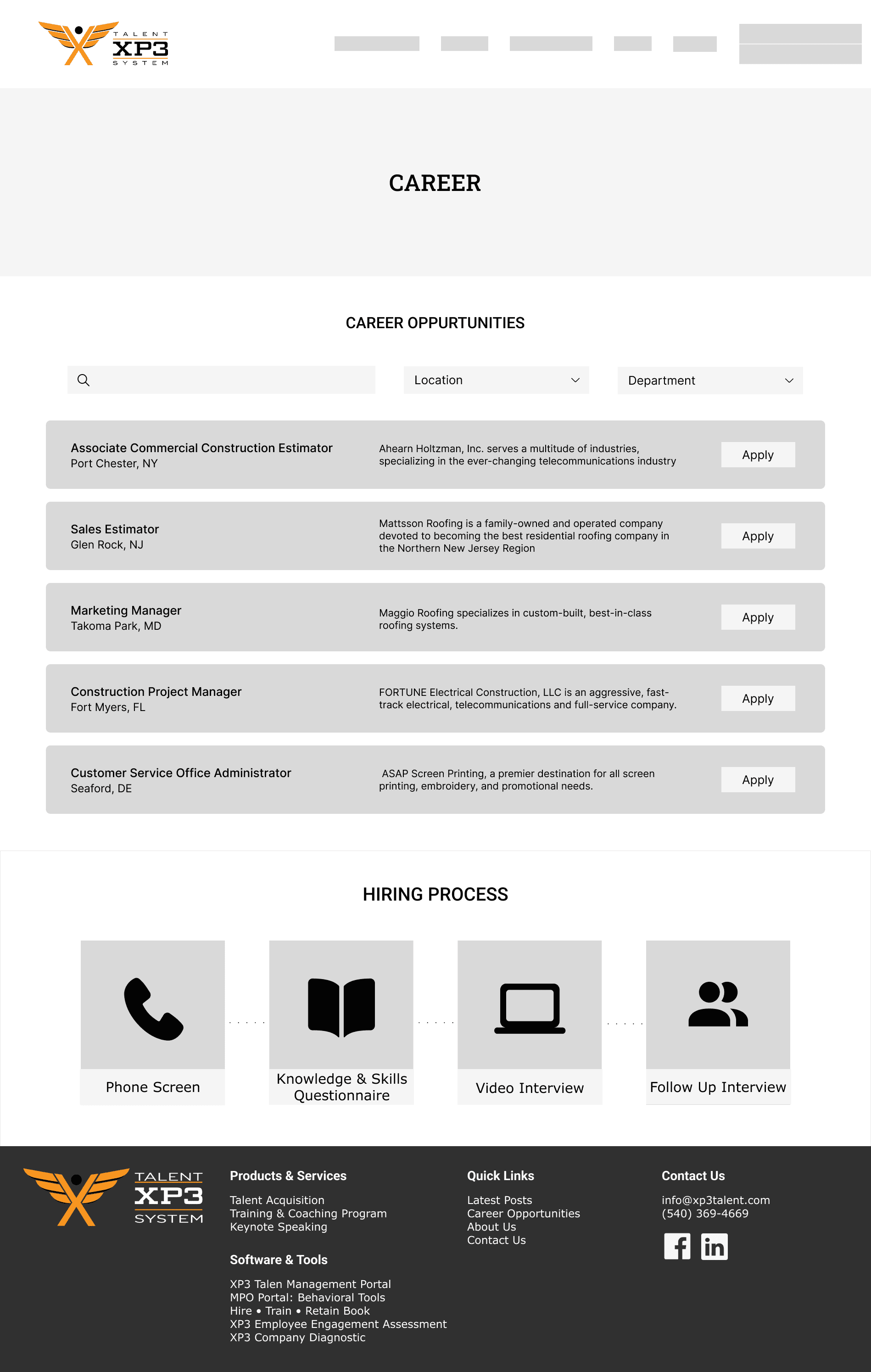
Career Opportunities Page
Job Posting Page
Success Screen Page
Creation
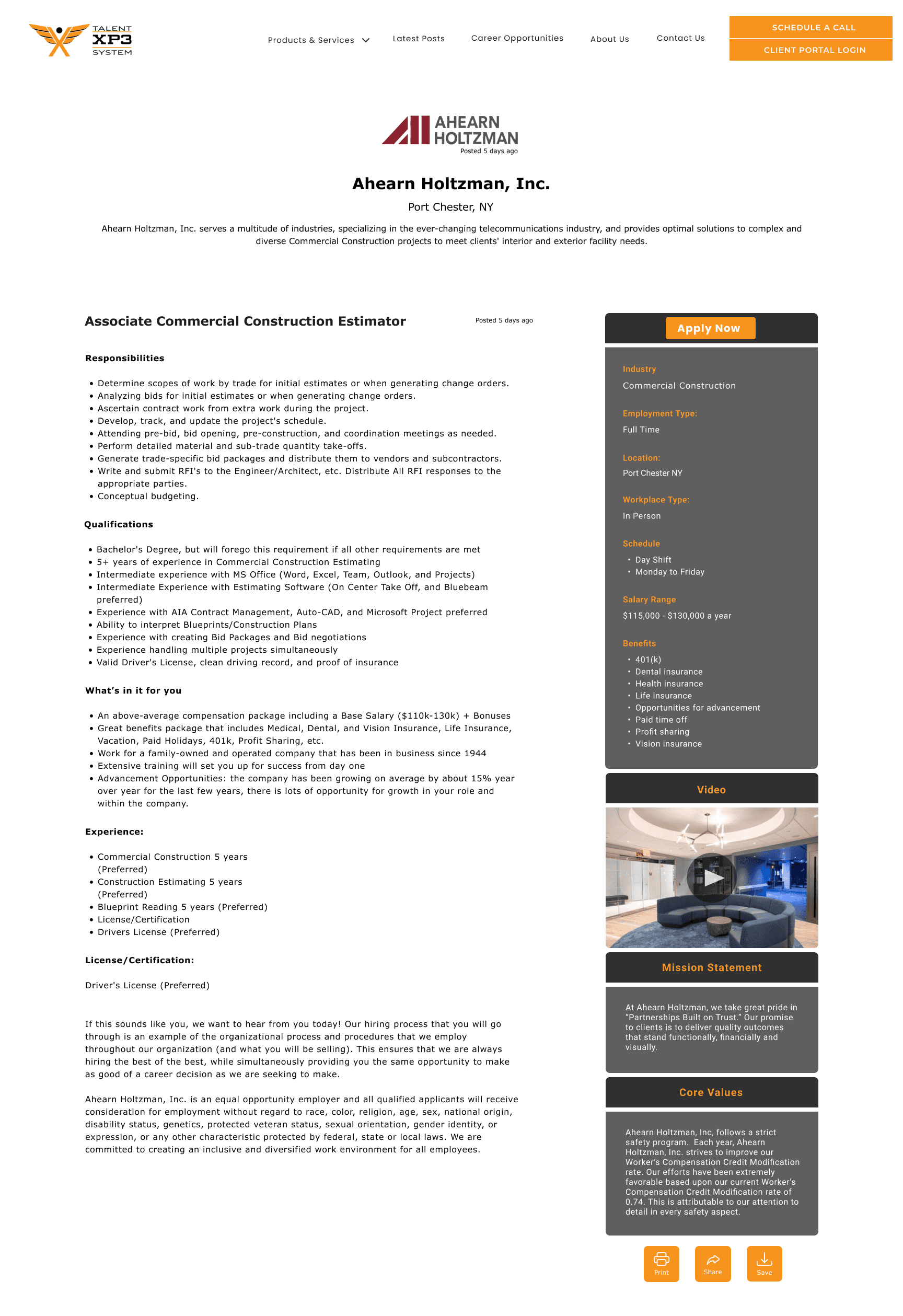
After getting the clients’ approval on the what features they liked from each wireframe we proceeded with creating the high fidelity screens.
Here are some of the key features:

Improvements
We conducted a usability test to validate the high-fidelity design for any significant issues. Since our target users are potential job candidates, recruiting participants was straightforward. According to Jackob Nielsen's principle that 'the best results come from testing no more than 5 users,' we involved 6 users in our usability testing. Overall, users navigated through the job listings and application process without encountering major issues.
One noteworthy finding is that users felt the orange banner on the career opportunities page was dominating the layout, drawing their attention immediately. In response, we decided to retain the banner's original design to maintain visual consistency across the website's headings and overall layout.


Before
After
Another issue I observed was that the color contrast within the container containing job information did not meet web design standards. It was crucial to adjust the background and text colors to ensure readability for all users. We presented two sets of color combinations to the client, allowing them to choose their preferred option.

Another feature I wanted to evaluate was the placement of the checkbox in the filter menu. Personally, I favored placing it on the left-hand side, while my team members had different preferences. To settle this, I implemented an A/B test, allowing users to choose their preferred placement.

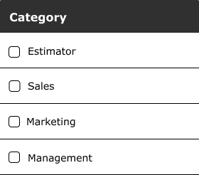
The test results disproved my assumption when they were evenly split 50/50. I saw no reason to alter it, so it remained unchanged.
Translating the Design into WordPress
I undertook the challenge of handling front-end development for the client to broaden my skill set and explore new areas. It took about a week to learn and implement the design for the job details page.
However, there were a few elements we couldn't include in the final website deliverable:
The Design
The Website
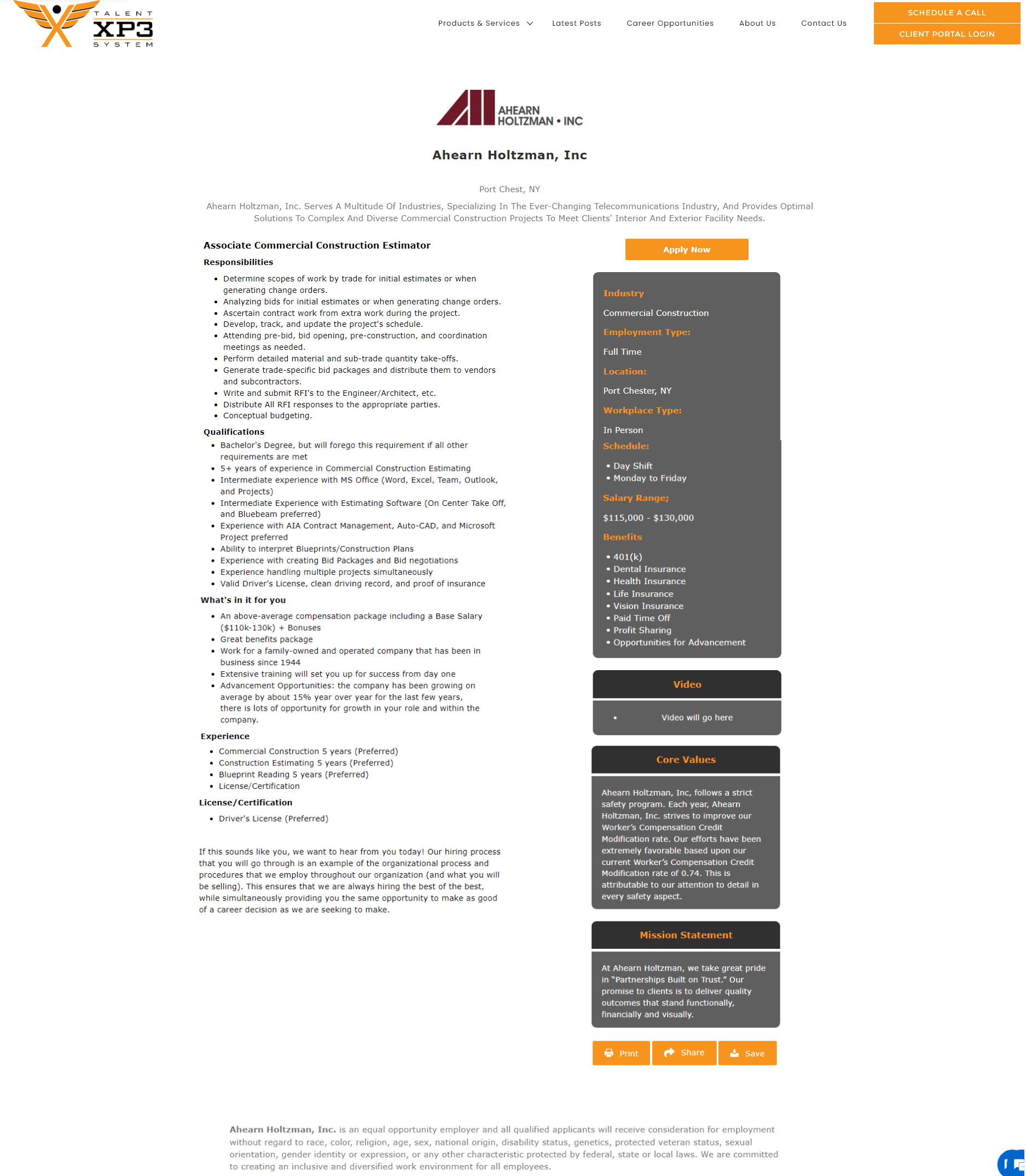
We we unable to retain the 'Posted Date' feature due to the complexity of setting it to update based on the posting date.
The 'Apply Now' button was not able to be placed within another container
Despite not being able to incorporate a few features, I am proud of the outcome. During our wrap-up call with the client, I effectively communicated the necessary backend coding requirements for the webpage buttons.
Summary
Overall this was a fulfilling experience for my first industry project. During this project there were some challenges with communication with my team, due us being on 3 different time zones. Since I chose to take on the role of team lead, I gained many valuable soft skills. Such as, adaptability by trying my best to accommodate everyone's schedules to find the best time for us to have calls. Also, gaining perspective on how to work in a design team and to give/take feedback.