


Friend Lab
The Social Event App
making meaningful connections through events
Our Hunger for Company
My Role
Research
UI/UX Design
Usability Testing
As human beings we crave a connection to others, whether it be romantic or platonic. It is engraved in ourselves as a basic need.
In this project, I helped a client design an mobile app that allows users to find events to attend with the intention of meeting new people. The company goal is to create a social user experience to aide users get out to do activities in-person.
Tools
Figma
The Focus
The company identified that the number of people who say they are going to an event is higher than the actual number of attendees. The lack of attendance has been an ongoing problem. The company data shows that only 20% of people who say that they will attend actually shows up.
The goal is to increase the numbers of accepted invites to event attendees through different features that the company can add.
Psychology & Human Motivators
I dove into the psychology behind why people would cancel an accepted invite to events for users specifically not attending due to anxiety.
Here is what I found online that drives people to attend events:
food, fun, and fame
sense of community
education
interaction with others
creating meaningful connections
The takeaway from that information is that I think the key part of why people attend events is the people, knowing you’re attending an event that you can find others who share the same interest is intriguing.
Here are a few things I researched on battling anxiety:
give positive reminders
validate your feelings
remember “the more we expose ourselves to situations that we fear, the more comfortable we become navigating them.” -Dr. Victoria Shaw
Stepping out of your comfort zone is nerve wrecking but having reminders or assurance of knowing others are facing a similar situation makes you feel like you’re not alone.
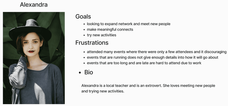
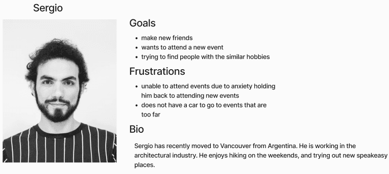
Local Social Butterfly
Persona
The Fresh Face


Based on user research and competitive analysis on similar industry, I began designing user flows to get a sense of the user’s journey throughout the app. Then I began sketching some ideas of possible screens.
Ideation
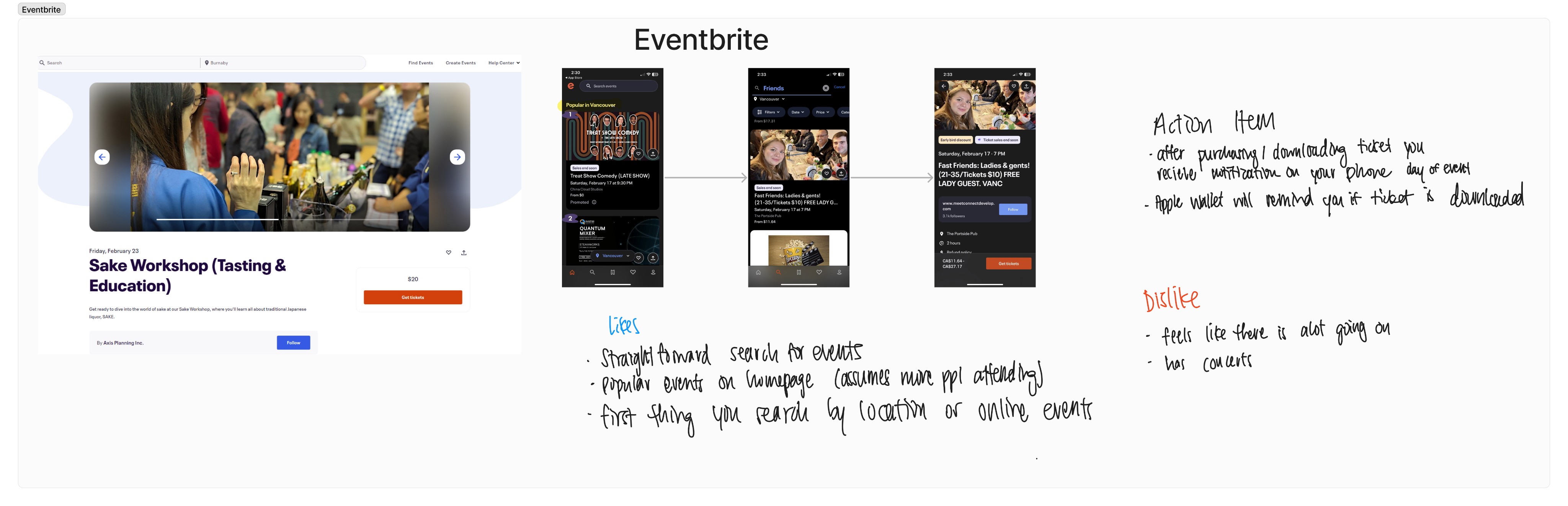
I took a lot of inspiration from current apps on the market and analyzed the usage of certain features.
Here are a few things I kept in mind:
users may not be getting effective communication about upcoming events
users need an incentive to attend


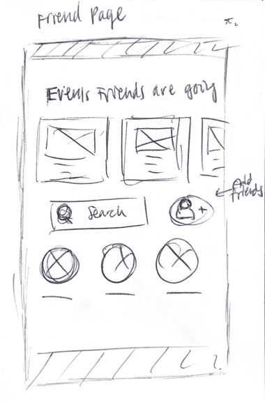
The feature of having a friends page was tested to see if users may possibly utilize this as a way to be more enticed to attending an event if you see someone you know going as well.
A guerilla test was conducted to see which layout users prefer. Here we have two versions of the homepage screen and I conducted an A/B test to see which one was ideal.
Color Palette

Typography
H1 - FriendLab
H2 - FriendLab
Body
BUTTON
Montserrat
Brand personality — a trusted friend that cares about helping people and making a difference in the world
Caring
Familiar
Humorous
Optimistic
Buttons
button
Button
BUTTON
BUTTON
Text Fields
Search Bar...
Insert Text Here
Defining the Aesthetic
Key Features
After confirming my assumptions with users on how they feel about specific features it was time to start creating the hi-fidelity screens!
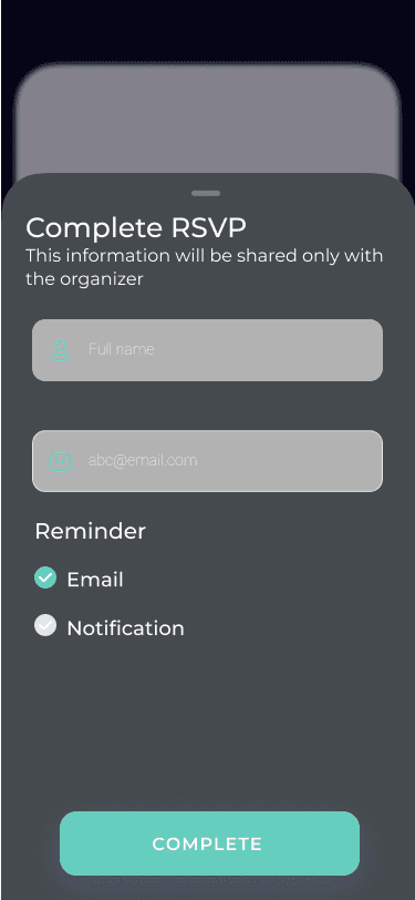
Having reminders is vital to attending events after user input it seems that having the option to pick either email or a notification is best as the preferred method is split 50/50.

4
1
1
2

3
Utilizing a friends page is a big way to persuade users to attend events because it gives users a sense of familiarity.
2
Having an customizable interest section give users a personalized experience and caters the type of events shown to be of interest to you.
3
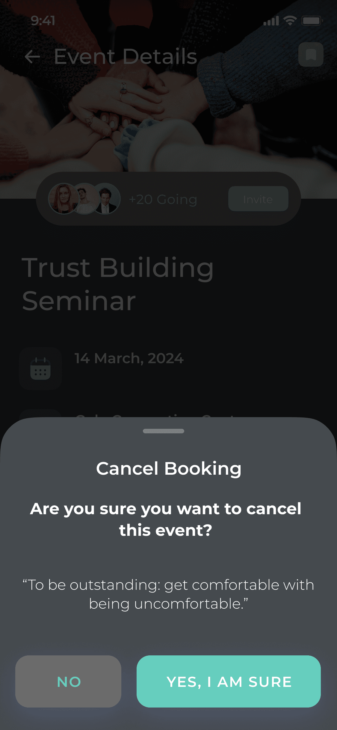
As many users find social anxiety as an obstacle to attending new events I tried including a motivation quote to get users to think twice about their decision to cancel. One user found this “cute” and another found themselves feeling a bit of peer pressure, which executes it job perfectly!
4

Old Events Tab
2
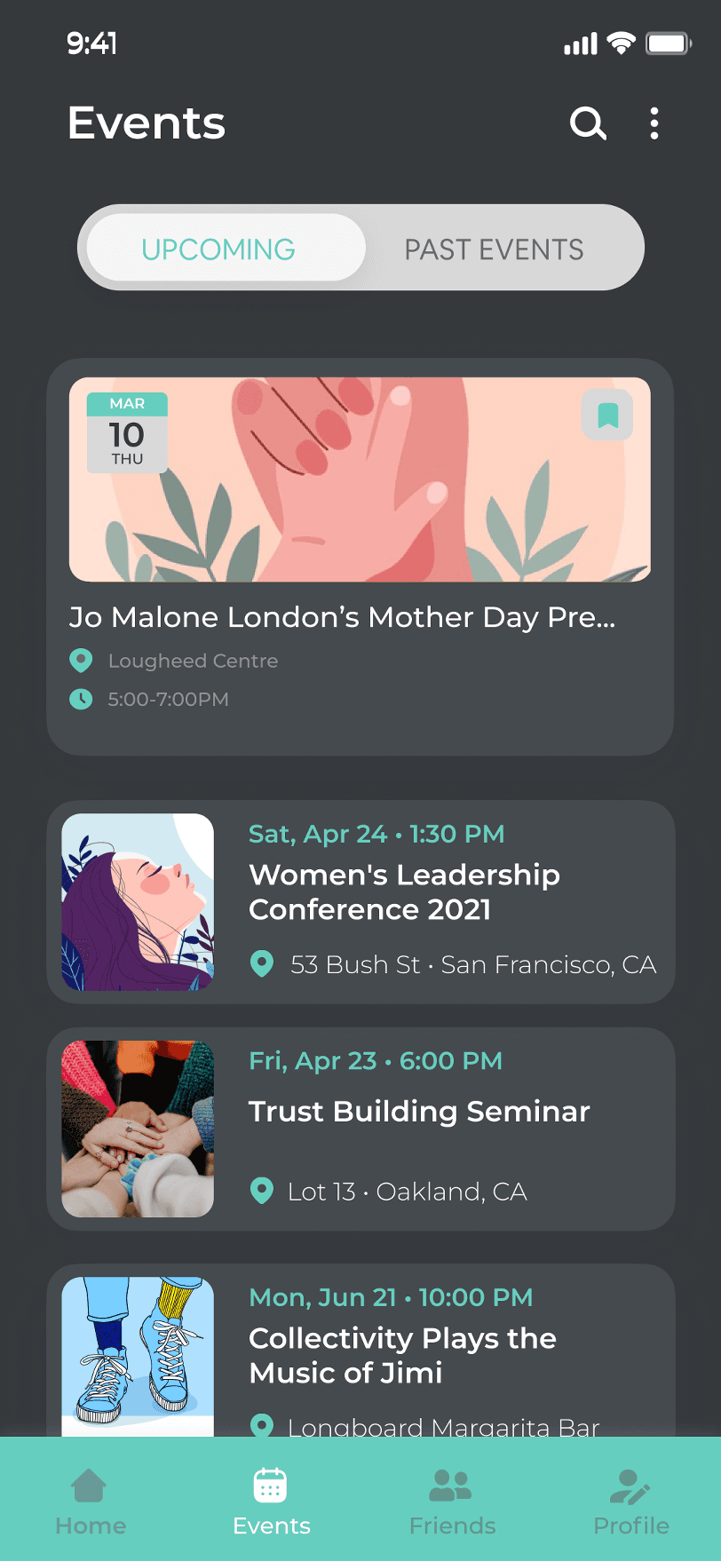
New Events Tab
Changes Implemented
3
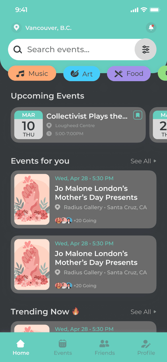
Moving the quick filters grouping right under the search bar made more sense for when users are searching they do not need to scan downwards to see the preset filters that are available.
Readability with the search bar and navigation bar, in order to make it stand out more I decided to change the accent color to white.
Users were confused with the events tab correlating to being where you would search for events, therefore coming the catergories to the homepage and reserving the events tab to view upcoming/past events.
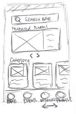
Old Homepage
1
1
1

New Homepage
1
1
2
2
3
3
Originally I had user complete the task of locating the reviews for an organizer. My assumption is that users would go straight into their profile, but it caused some confusion in the usability test. It then occurred to me that before even following the organizers you would most likely preview their information when you are previewing an event.
Once I changed the flow on the prototype, the user’s did not face the same challenges.

The issues that occurred during the first round of testing did not occur during the second round of test. There was less confusion overall with the tabs on the navigation bar. I took a lot of inspiration from current apps on the market and analyzed the usage of certain features. To keep the app familiar I did not want to go crazy and try out new features.
Josephine Chow
Thank you for checking out my case study!
Final Thoughts